The number of people who own smartphones and tablets continues to grow, as does mobile internet traffic. According to a recent study, mobile traffic is expected to increase thirteen times in the next five years. All these mobile activities translate into a greater need for WordPress users to ensure that their site is easy to read on all devices: desktop, tablet, and smartphone. In this article, we will present the best themes and add-ons for WordPress mobile devices, including WordPress options hosted automatically.
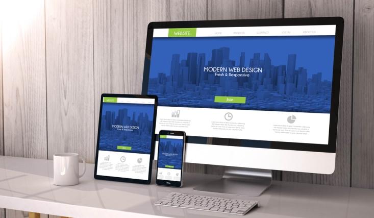
Understand WordPress Mobile Response Themes
The easiest way to ensure that visitors to your website enjoy an optimal experience regardless of the device they use is to apply a responsive theme. The hemes are specifically designed to make your website beautiful, on any device at any resolution.
Get Your Stand-Alone WordPress Website Ready For Mobile Devices
Freelance WordPress users have the option of applying a responsive theme (the simplest approach) or installing a mobile plug-in (suitable for those wishing to use a non-responsive theme).
Responsive Premium Themes for Self-Hosted WordPress
If you’re looking for a premium theme, Flexithemes has the best options for you:
- HealthPlan: HealthPlan is a clean, attractive Health/Fitness responsive WordPress theme.
Packed with custom created widgets to customize your sidebar or widget areas, you will have an easy to use administration panel where you can easily customize the theme. You can have your site up and running quickly with HealthPlan. - Rexa: Rexa is a serious WordPress theme, yet it is clean and fully responsive. It is ready to go for desktop computers, tablets, and mobile phones.
You can switch out the background image for something lighter to provide contrast between the main colors of the theme. - Classica: Classica is a clean, classy General/Blog responsive WordPress theme. It is compatible with the latest WordPress version. Change your logo, favicon or featured images options easily from the easy-to-use administration panel. Lots of custom widgets are also included with the theme.
- Knowledge: Knowledge offers a fresh new Education design for WordPress. Knowledge can be re-branded to your own website with just a few clicks. You can update your logo, icon and banners from within the theme options.
- Focus: Focus WordPress Theme is a clean, trendy, modern and straight forward responsive theme designed especially for General/Blog websites or blogs. This theme compatible and easy to use on various devices and screen sizes.
- We have over 2,000 others available and they are all responsive!
Free Responsive Themes for Self-Hosted WordPress
If you have a limited budget, our premium themes only cost $19 each. If that’s out of budget, all our themes are available for free as well. But the free ones include some sponsor links in the footer.
Using a Mobile Add-On

If your favorite WordPress theme does is not responsive, installing a mobile add-on is a good way to solve this problem. Here are some easy-to-use add-ons for automatically hosted WordPress sites:
- Obox Mobile: Create a personalized experience for mobile device users. This premium add-on is priced at $60.
- WP Mobile Detector: Detects if a site visitor uses a mobile device and, in this case, switches to a WordPress theme for the mobile device.
- WPtouch: Transforms your WordPress site into a mobile application, accessible from a variety of mobile devices, including iPhone, iPod touch, Palm Pre/Pixi devices, BlackBerry and Android. Get your website hosted by WordPress.com ready for mobile devices
By default, WordPress.com comes with a mobile theme enabled. This theme works with the installed theme (as default, Twenty Twelve) and is designed to quickly load and display well on a small screen. To search for other hospitality topics, click the Feature Filter link on the Manage Matters screen (select Appearance, Menu Arguments), select the Interactive Design check box, and click the Search button.
If your favorite theme does not have a responsive design, WordPress.com displays the Mini-eleven theme (modified by the Twenty Eleven theme) for mobile readers.
You can turn off the mobile theme on WordPress.com or specify other settings in the Mobile Device Options screen (select Appearance, Mobile in the menu). However, unless you have a specific reason to disable it, you must leave it enabled. Preview the appearance of your website on mobile devices first.
According to experts at umbrellar.com, the most obvious way to test the responsiveness of your website is to see it on a smartphone or tablet. If you prefer to test your site during design, here are two useful tools you can use on your desktop computer:
- Responsive Design View of Firefox: This feature, introduced in Firefox 15, allows you to preview a web page open in different sizes. To activate this view, select Web Developer, Responsive Design View in the Firefox menu, or press Ctrl + Shift + M.
- Resizer: if you do not use Firefox, this bookmarklet offers another option to preview the website. Simply drag the marker to the bookmarks bar and click the Resizer button when you want to preview a web page open in another dimension, like Mobile, Small tablet, Tablet, Panorama or HDTV.
Final Thoughts
With these themes, add-ons and simple tools, you can make your website easy to navigate for all visitors to your website, regardless of the device they use to access them.
Short Summary: Patrice-Anne Rutledge shows you how to make your WordPress website ready for use on mobile and easy-to-read devices on smartphones and tablets, with the latest WordPress Mobile Answer Add-on issues and preview tools.
Long Summary: Do you want to ensure that visitors enjoy an optimal experience on their WordPress website, regardless of the device they are using? WordPress makes it easy to create a website ready for mobile devices that fit perfectly in any aspect, from a widescreen device to a smartphone. In this article, Patrice-Anne Rutledge, author of Enterprise Technology, provides an overview of the topics that correspond with WordPress and suggests different thematic options for users hosted on WordPress and self-hosted, and covers the latest mobile accessories while presenting numerous useful mobile preview tools.